I’ve made a new logo for Ska Studios, which is the new name for the new Limited Liability Corporation that I’m creating (truth be told, the real company name is Ska Studios LLC).

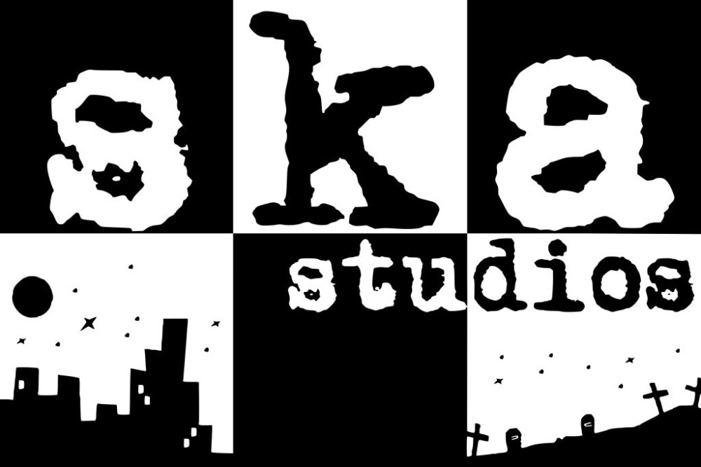
Like it? Love it? Hate it? I’m probably keeping this version, one way or another.
todos los que estan en contra de los ska son estupidos
torpes tontos y pendejos
aqui los mejores son los texas, ska y los fresas
nacos los cholos
entiendalo puro ska y todods los que firmaron aqui
disiendoles cosas alos ska son los estupuidos
i’d say it’s about perfect… i dig the subtle callout to dishwasher. plus, ska has always been black and white (and in that font) so i think it all works pretty well.
IT IS A GOOD LOGO
IT SAYS SKA STUDIOS RIGHT ON IT
I like it
I think it rules 🙂